List of Setting Types
Overview
Developers can use different setting types to allow merchant to configure their own page in SHOP Builder. Below are the list of available setting types, and their corresponding available attributes.
For each setting type, the value obtained in the JSON data of the storefront will be different. These are explained in the Return section of every setting type.
Standard Attributes
Below are the standard attributes for every input configuration.
(If Required is -, it means it depends on the setting type.)
| Attribute | Description | Type | Required |
|---|---|---|---|
| id | Control ID, used to access the configuration value. | I18n | - |
| type | Control type, can be any basic or specialized input control type. | String | Yes |
| label | Control label, displayed in the theme editor. | Array | - |
| info | Tip text for this configuration. | I18n | No |
| is_multi_lang | Whether to support multi-language configuration. After it is enabled, different languages correspond to different data. | Boolean | - |
| default | Default value of the configuration. | Boolean | - |
is_multi_langis valid for all types, and will be adjusted later to only be valid fortexturltextimage_pickerconfiguration
Common data specifications
Below are some common configurations across all setting types:
i18n
The currently supported language flags are en, zh-hant, zh-cn, th, vi . By default, en is used for display.
Example code:
{
  "zh-hant": "圖文組合",
  "zh-cn": "图文组合",
  "en": "Image with Text",
  "th": "รูปภาพพร้อมข้อความ",
  "vi": "Hình ảnh với văn bản"
}
Using icons in settings
You can add icon to the settings.
Currently supported data are text design copyright video image social_icon menu header footer instagram slideshow category products cart product payment email subscription countdown blog accordion time square circle h h1 h2 h3 h4 h5 h6 desktop mobile dot filter breadcrumb sort desc.
Example code:
{
  "type": "group_header",
  "icon": "video",
  "label": {
    "en": "Video"
  }
},
{
  "type": "url",
  "id": "title",
  "label": {
    "en": "title"
  },
  "default": "",
  "placeholder": "Please enter the title"
},
{
  "type": "group_end"
},
Effect in the editor:

Using links in text
You can add hyperlinks to the info attribute in each configuration.
Example code:
{
  "type": "switch",
  "id": "show_hidden_product",
  "label": {
    "en": "Show Hidden Products"
  },
  "info": {
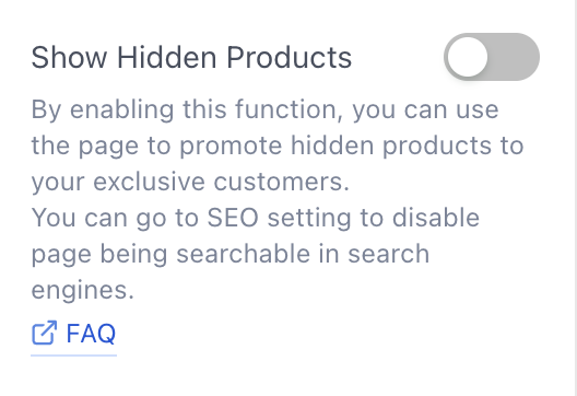
    "en": "By enabling this function, you can use the page to promote hidden products to your exclusive customers. \nYou can go to SEO setting to disable page being searchable in search engines.\n[FAQ](https://support.shoplineapp.com/hc/en-us/articles/360034106952-Hidden-Product-Show-Page)"
  },
  "default": false
}
Effect in the editor:
Using links with placeholders in text
You can add a hyperlink with a placeholder to the information property in each configuration.
The rules are as follows
| key | value |
|---|---|
| handle | Merchant handle. |
Example code:
{
  "type": "paragraph",
  "content": {
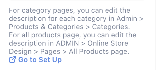
    "en": "For category pages, you can edit the description for each category in Admin > Products & Categories > Categories.\n For all products page, you can edit the description in ADMIN > Online Store Design > Pages > All Products page.\n[Go to Set Up](https://admin.shoplineapp.com/admin/<%=handle%>/categories)"
  }
}
Effect in the editor:
Basic Input Settings
Below are the basic input control types:
text
Set type to text to display a single-line text control. In addition to the standard attributes, the text control has the following attributes:
| Attribute | Description | Required |
|---|---|---|
| placeholder | Input box placeholder text | No |
| limit | Text length limit | No |
Example code:
{
  "id": "title",
  "type": "text",
  "is_multi_lang": true,
  "label": {
    "en": "Title",
    "zh-hant": "標題"
  },
  "default": "Paragraph Title"
}
Effect in the editor:

Return:
The return value of the text control is of string type.
url
Set type to url to display a URL input control, the url control has the following attributes:
| Attribute | Description | Required |
|---|---|---|
| placeholder | Input box placeholder text | No |
| limit | Text length limit | No |
Example code:
{
  "id": "title",
  "type": "text",
  "is_multi_lang": true,
  "label": {
    "en": "Title",
    "zh-hant": "標題"
  },
  "default": "Paragraph Title"
}
Effect in the editor:

Return:
The return value of the url control is of string type.
switch
Set type to switch to display a switch control. This control can be used to toggle features on and off, such as displaying the title.
Example code:
{
  "type": "switch",
  "id": "switch",
  "label": {
    "en": "Show title"
  },
  "default": true
}
Effect in the editor:

Return:
The return value of the switch control is of boolean type.
range
Set type to range to display a slider control. It displays the current value and the selectable range. In addition to the standard attributes, the range control has the following attributes:
| Attribute | Description | Required |
|---|---|---|
| min | Minimum value | No |
| max | Maximum value | No |
| step | Slider step, must be greater than 0 and divisible by (max - min). | No |
| unit | Unit of the input value. For example, you can set the px unit for a width slider. | No |
Example code:
{
  "type": "range",
  "id": "image_width",
  "label": {
    "en": "Image width"
  },
  "default": 300,
  "min": 200,
  "max": 500,
  "step": 10,
  "unit": "px"
}
Effect in the editor:

Return:
The return value of the range control is of number type.
radio
Set type to radio to display a radio button control. In addition to the standard attributes, the radio control requires the options attribute, which accepts an array defined by value and label.
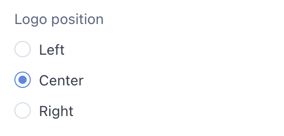
This control can be used for single selections among multiple options, such as the logo position.
The radio control has the following attributes:
| Attribute | Description | Required |
|---|---|---|
| placeholder | which accepts an array defined by value and label | No |
| limit | Text length limit | No |
Example code:
{
  "type": "radio",
  "id": "logo_position",
  "label": {
    "en": "Logo position"
  },
  "options": [
    {
      "label": {
        "en": "Left"
      },
      "value": "left"
    },
    {
      "label": {
        "en": "Center"
      },
      "value": "center"
    },
    {
      "label": {
        "en": "Right"
      },
      "value": "right"
    }
  ],
  "default": "center"
}
Effect in the editor:
Return:
The return value of the radio control is of string type.
checkbox
Set type to checkbox to display a single checkbox control. This control can be used to toggle features on and off, such as displaying the search entrance.
Example code:
{
  "type": "checkbox",
  "id": "show_search",
  "label": {
    "en": "Show search"
  },
  "default": true
}
Effect in the editor:

Return:
The return value of the checkbox control is of boolean type.
select
Set type to select to display a dropdown menu control. A dropdown menu is displayed for the user to select an option. In addition to the standard attributes, the select control requires the options attribute, which accepts an array defined by value and label.
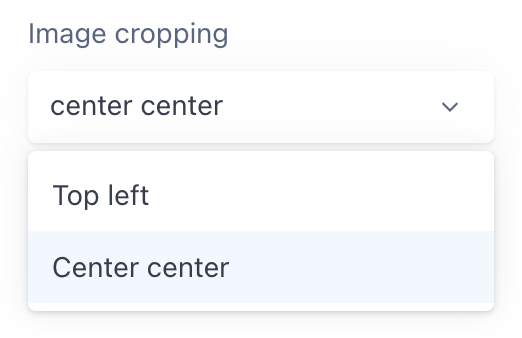
This control can be used for single selection among multiple options, such as image size.
| Attribute | Description | Required |
|---|---|---|
| options | which accepts an array defined by label and value. | No |
| limit | Text length limit | No |
Example code:
{
  "type": "select",
  "id": "image_cropping",
  "label": {
    "en": "Image cropping"
  },
  "options": [
    {
      "value": "top_left",
      "label": "Top left"
    },
    {
      "value": "center_center",
      "label": "Center center"
    }
  ],
  "default": "center center"
}
Effect in the editor:
Return:
The return value of the select control is of string type.
time_range
Set type to time_range will output a time range. This control can set the start and end time.
Example code:
{
  "type": "time_range",
  "id": "period",
  "label": {
    "en": "Period"
  },
  "placeholder": [
    "Start Date",
    "End Date"
  ],
  "default": []
}
Effect in the editor:
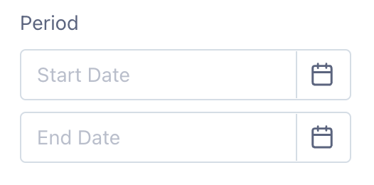
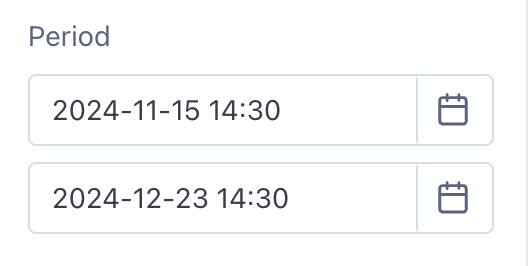
Affected by time zone. Default value should be an array with the start time and the end time in UTC.
Example code:
{
  "type": "time_range2",
  "id": "period",
  "label": {
    "en": "Period"
  },
  "placeholder": [
    "Start Date",
    "End Date"
  ],
  "default": ["2024-11-15T06:30:00.441Z", "2024-12-23T06:30:00.842Z"]
}
Effect in the editor:
Return:
The return value of the time_range control is of UTC time array. The following is an example:
["2024-11-15T06:30:00.441Z", "2024-12-23T06:30:00.842Z"];Specialized Input Settings
Below are the specialized input control types:
vertical_align
Set type to vertical_align to display a vertical alignment control. This control can be used to control the alignment of components along the vertical cross-axis, such as the alignment of elements in each row.
| Attribute | Description | Required |
|---|---|---|
| options | Which accepts an array. | No |
| options[].value | Option value. It is a string and must be one of the following: top, middle, bottom | Yes |
| options[].description | Option description. | No |
Example code:
{
  "id": "vertical_align",
  "type": "vertical_align",
  "label": {
    "en": "Vertical align"
  },
  "default": "middle"
}
Effect in the editor:

You can also customize the list of options.
Example code:
{
  "id": "vertical_align",
  "type": "vertical_align",
  "label": {
    "en": "Vertical align"
  },
  "options": [
    {
      "value": "top"
    },
    {
      "value": "bottom",
      "description": "Display on bottom of component"
    }
  ],
  "default": "top"
}
Effect in the editor:
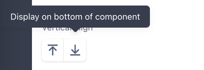
Return:
The return value of the vertical_align is of string type with the attributes: top, middle, bottom.
text_align
Set type to text_align to display a vertical alignment control. This control can be used to control the alignment of components along the horizontal cross-axis, such as the alignment of elements in each row.
| Attribute | Description | Required |
|---|---|---|
| options | Which accepts an array. | No |
| options[].value | Options value,It is a string and must be one of the following: left,center,right | Yes |
| options[].description | Options description. | No |
Example code:
{
  "id": "text_align",
  "type": "text_align",
  "label": {
    "en": "Text align"
  },
  "default": "center"
}
Effect in the editor:

You can also customize the list of options.
Example code:
{
  "id": "text_align",
  "type": "text_align",
  "label": {
    "en": "Text align"
  },
  "options": [
    {
      "value": "left"
    },
    {
      "value": "right",
      "description": "Display on right of component"
    }
  ],
  "default": "left"
}
Effect in the editor:
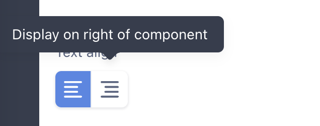
Return:
The return value of the text_align is of string type with the attributes: left,center,right.
tabs
Set type to tabs to customize the tabs control.
| Attribute | Description | Required |
|---|---|---|
| options | Which accepts an array. When no value is passed, it is the same as text_align control. | No |
| options[].value | Options value,It is a string and must be one of the following: top, middle, bottom | Yes |
| options[].icon | Options icon, Please set at least one of the icon and label attributes. | No |
| options[].label | Options label, Please set at least one of the icon and label attributes. | No |
| options[].description | Options description. | No |
Example code:
{
  "id": "shape",
  "type": "tabs",
  "label": {
    "en": "shape"
  },
  "default": "square",
  "options": [
    {
      "value": "square",
      "icon": "square"
    },
    {
      "value": "circle",
      "icon": "circle"
    }
  ]
}
Effect in the editor:

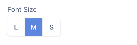
You can also use the label attribute in options.
Example code:
{
  "id": "font_size",
  "type": "tabs",
  "label": {
    "en": "Font Size"
  },
  "default": "1",
  "options": [
    {
      "value": "1.2",
      "label": {
        "en": "L"
      },
      "description": {
        "en": "Large"
      }
    },
    {
      "value": "1",
      "label": {
        "en": "M"
      },
      "description": {
        "en": "Middle"
      }
    },
    {
      "value": "0.8",
      "label": {
        "en": "S"
      },
      "description": {
        "en": "Small"
      }
    }
  ]
}
Effect in the editor:
Return:
The return value of the tabs control is of string type.
richtext
Set type to richtext to display a rich text control, The rich text control has the following attributes:
| Attribute | Description | Required |
|---|---|---|
| toolbar | A string separated by ",", The data contained must be image,list,font_color,font_size,font | No |
Example code:
{
  "type": "richtext",
  "id": "content",
  "label": {
    "en": "Content"
  },
  "default": "Input your text contents to promote your product, or tell the story about your shop."
}
Effect in the editor:

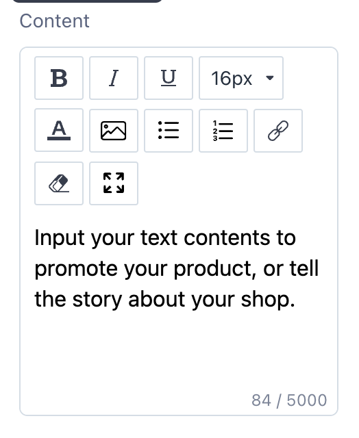
If you need to use all the functions, please also set the toolbar attribute.
Example code:
{
  "type": "richtext",
  "id": "content2",
  "label": {
    "en": "Content"
  },
  "toolbar": "image,list,font",
  "default": "Input your text contents to promote your product, or tell the story about your shop."
}
Effect in the editor:
Return:
The return value of the rich_text control is of string type. The following is an example:
<p>Rich text content</p>color_picker
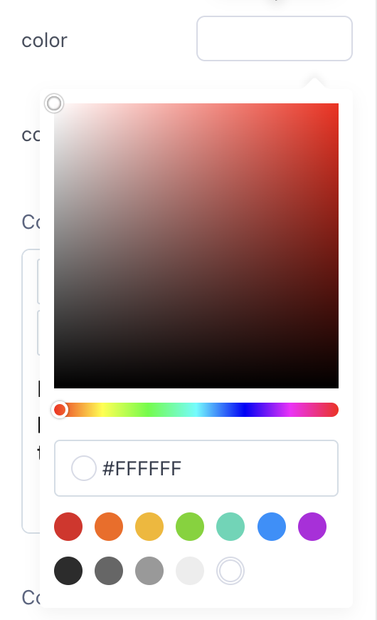
Set type to color to display a color selection control. You can manually enter the color value in the input box. There is also a color palette selector for quick color selection by dragging the shader.
This control can be used to control the UI color of elements, such as the global background color.
Example code:
{
  "id": "title",
  "type": "text",
  "is_multi_lang": true,
  "label": {
    "en": "Title",
    "zh-hant": "標題"
  },
  "default": "Paragraph Title"
}
When configuring the default value, The default attribute value must be a 6-character string containing 0-F. Non-compliance will result in errors.
Effect in the editor:
Return:
The return value of the color_picker control is of object type. The following attributes are returned:
| Attribute | Description |
|---|---|
| hex | It is a string containing characters from 0 to F6. |
Return data example:
{
  "hex": "F3F3F3"
}
image_picker
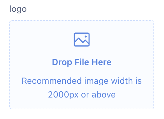
Set type to image_picker to display an image selection control.
Example code:
{
  "type": "image_picker",
  "id": "logo",
  "label": {
    "en": "logo"
  },
  "placeholder": {
    "en": "Recommended image width is 2000px or above"
  },
  "default": {}
}
The "default" attribute of the image_picker control is required, but may be adjusted to be optional in the future
Effect in the editor:
If you need to use a custom image, you can refer to the following:
{
  "type": "image_picker",
  "id": "logo2",
  "label": {
    "en": "logo"
  },
  "placeholder": {
    "en": "Recommended image width is 2000px or above"
  },
  "default": {
    "url": "https://www.shopline.com/logo.png"
  }
}
Return:
The return value of the image_picker control is of Image type.
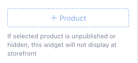
product_picker
Set type to product_picker to display a product selection control. This control allows direct selection of all available products in the store. The product_picker control has the following attributes:
| Attribute | Description | Required |
|---|---|---|
| ui_options | UI configuration options. | No |
| ui_options.disable_product_set | Whether to disable product set. The default value is false. | No |
Example code:
{
  "type": "product_picker",
  "id": "product",
  "label": {
    "en": "Product"
  },
  "info": {
    "en": "If selected product is unpublished or hidden, this widget will not display at storefront"
  },
  "ui_options": {
    "disable_product_set": true
  }
}
The product_picker control does not support the default attribute.
Effect in the editor:
Return:
The return value of the product_picker control is of Product type.
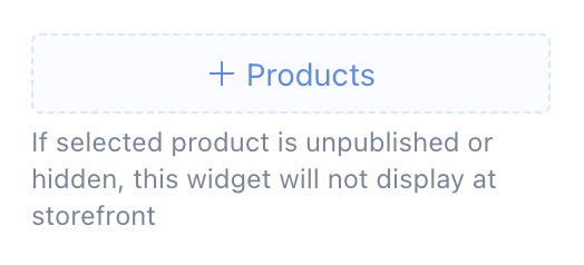
products_picker
Set type to products_picker to display a products selection control. This control allows direct selection of multiple products available in the store. The products_picker control has the following attributes:
| Attribute | Description | Required |
|---|---|---|
| ui_options | UI configuration options. | No |
| ui_options.disable_product_set | Whether to disable product set. The default value is false. | No |
| ui_options.max_products_limit | Maximum number of products available. The default value is 25. | No |
Example code:
{
  "type": "products_picker",
  "id": "products",
  "label": {
    "en": "Product"
  },
  "info": {
    "en": "If selected product is unpublished or hidden, this widget will not display at storefront"
  },
  "ui_options": {
    "disable_product_set": false
  }
}
The products_picker control does not support the default attribute.
Effect in the editor:
Return:
The return value of the products_picker control is of Product type.
collection_picker
Set type to collection_picker to display a category selection control. This control allows direct selection of all available product categories in the store. The collect_picker control has the following attributes:
| Attribute | Description | Required |
|---|---|---|
| ui_options | UI configuration options. | No |
| ui_options.disable_product_set | Whether to disable product set. The default value is false. | No |
| ui_options.max_products_limit | The maximum number of products that can be returned. The default is unlimited. | No |
Example code:
{
  "type": "collection_picker",
  "id": "collection"
}
Effect in the editor:

Return:
The return value of the collect_picker control is of Category type.
Auxiliary input settings
The auxiliary input setting control does not support "id" and "default" attributes.
Below are the specialized input control types:
paragraph
Set the type to paragraph to display the paragraph control, the paragraph control has the following attributes:
| Attribute | Description | Required |
|---|---|---|
| content | Description paragraph content. | No |
Example code:
{
  "type": "paragraph",
  "content": {
    "en": "It will display the most recent blog post first, according to the post quantity you set."
  }
}
Effect in the editor:

tags
Set type to tags to show the tag control.
Example code:
{
  "type": "tags",
  "labels": [
    {
      "en": "Product listing page"
    },
    {
      "en": "Mobile menu"
    }
  ]
}
Effect in the editor:

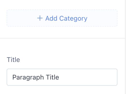
header
Set type to header to show separators control.
Example code:
{
  "type": "header"
}
Effect in the editor:
group_header and group_end
Set type to group_header to display collapsed modules control. group_end marks the end of the group items.
The group_header control has the following attributes:
| Attribute | Description | Required |
|---|---|---|
| icon | Collapse module icon. | No |
Example code:
{
  "type": "group_header",
  "icon": "video",
  "label": {
    "en": "Video"
  }
},
{
  "type": "url",
  "id": "youtube_url",
  "label": {
    "en": "Youtube url"
  },
  "default": "",
  "accept": ["youtube", "youtu.be"],
  "placeholder": "Please enter http url"
},
{
  "type": "group_end"
}
group_header control must be configured together with group_end control
Effect in the editor:

Folding style
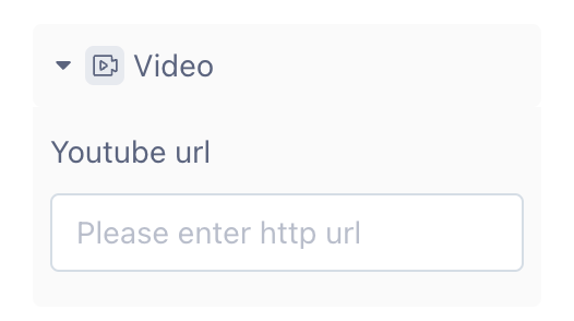
Expand Style
Updated 6 months ago
